

#032 Severance

Hey there!
I watched Severance back in April and I made my wife watch it too. I wrote a little something that I forgot to share (silly me). So here it is. I am sharing right now because I still know people who haven’t seen this masterpiece of a show, and I want them to see it!
If someone has forwarded this to you and you liked it, subscribe by clicking here! I am Jay and I will be sharing the what's what from everywhere.
Severance
Severing our memories between work life and personal life. Might be a great idea to have a perfect work-life balance.
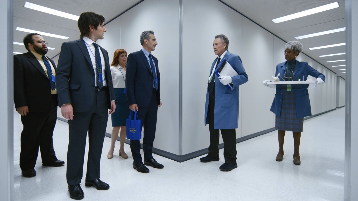
I enjoyed every bit of the show. The plot is intriguing, to say the least. A big mysterious corporate has a floor where the kind of work that happens cannot be known about outside the floor. For that, employees who are willing are expected to sever their memories, a procedure where a long chip is inserted into their brains, which, when employees enter the floor, activates one part of the brain. On leaving the floor, this part is deactivated and they are back to their personal life, with no memory whatsoever of what they were doing while they were at work.
However, enough about the plot. Being a design-ey newsletter that it is, what I do want to talk about is this show’s art direction. Colour has an important role to play in every frame of this show. Being set in a cold, snowy and somewhat less-populated town, the blue white and black hues dominate the show. Even the character’s hairs are either greyish white or black. There’s always a single warm colour that complements the otherwise cold visuals. This balance of colours directs the gaze of the viewer towards the right things at the right time. The show is a visual treat. The frames of the show utilise the rule of thirds and perspectives quite well too.
Title sequence
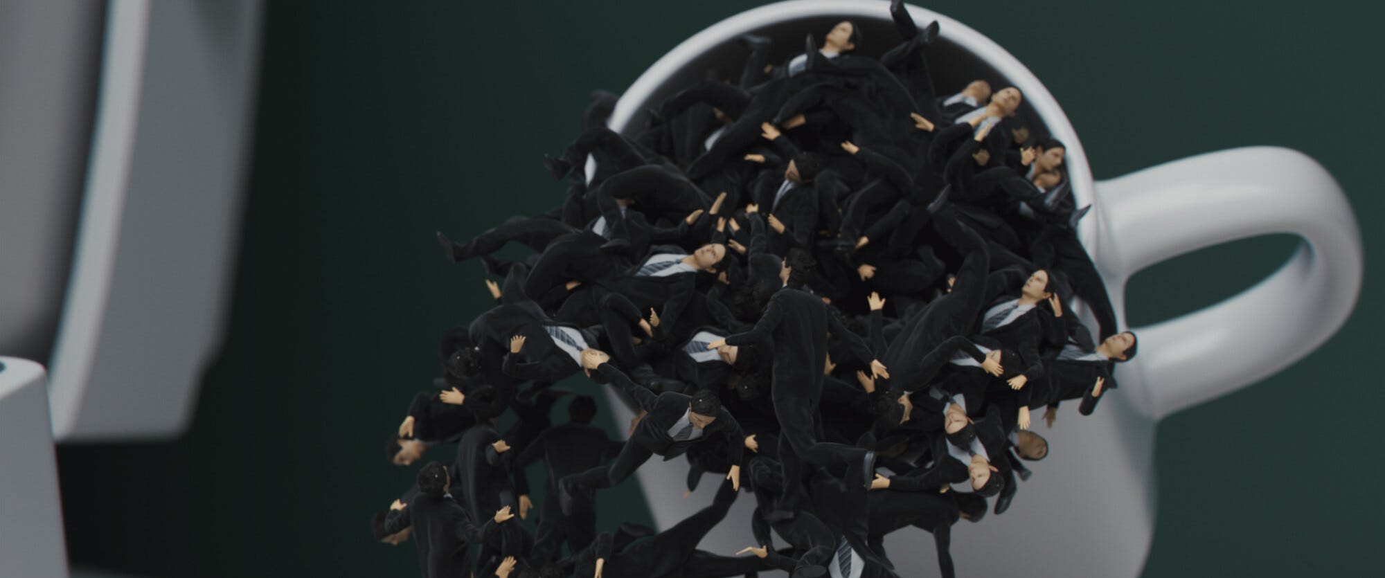
Also, I want to take a minute to appreciate the title sequence. In an age where we’re (mostly) skipping intros, the intro of severance is such a breath of fresh air. Probably the best one since Silicon Valley sequences. I think this one was inspired by surrealist art. It was robotic. It was controlled. And yet, it was playful. It shows the main protagonist, Mark, struggling to shuffle between his work life and personal life, even though they’re both supposed to be distant and have different memories.

So, do yourself a favour and watch it ASAP if you haven’t. It’s out on Apple TV.
Already watched? Tell me how you liked it. 🙂
Good Reads
What makes a collaboration click? — The team at Figma did research on how can teams collaborate better to build great products.
Cancel Amazon Prime — The subscription service is Amazon’s most significant—and most terrifying—invention.
What is a weird internet career? — These are the kinds of jobs that are impossible to explain to your parents, people who somehow make a living from the internet, generally involving a changing mix of revenue streams.
Pixar’s 22 Rules of Storytelling — originally tweeted by Emma Coats, Pixar’s Story Artist, I think these apply to anyone who is in the business of storytelling, especially designers.
That’ll be all for this one. Hope you enjoyed reading this. Share it with someone who you think will like Hyperlink by clicking on the button below👇 . Stay safe and see you'll in the next issue!
Also, you can follow me at Instagram for Musings, Twitter for Ramblings, and Command Space for work.