Hey there!
How are you holding up this week?
If someone has forwarded this to you and you liked it, subscribe by clicking here! I am Jay and I will be sharing the what's what from everywhere.
On personal values
The last few weeks have been intense at work. And then there’s the news of the Russian invasion while we are here continuing with business as usual. Something just doesn’t feel right.
Just a few days back I came across this podcast where the hosts discussed personal values. Personal values are something that helps one identify what matters most to them. These become guardrails to your decision-making while ensuring high quality of work and life. The hosts talk about their journey on how they came up with theirs.
I asked myself — do I have any personal values? Do I hold myself accountable to them? What framework did I follow that helped me in taking decisions? I mean I know they’re somewhere there in my head. But I think I am going to spend some time and jot them down. And probably you should too. Let’s see how they turn out.
Good Reads
The Flow State: How to get in the Zone and Stay There — We don't need more tools to cope with the never-ending distractions. We need to understand what is the flow state and how we can stay there for prolonged periods of time.
What makes writing more readable? — Looking at how to make writing easier to read
What doesn’t need to be done — Finishing things requires simplification
For Designers — Thirteen ****pieces of timeless advice given to M.Des (Strategic Design Management) students of National Institute of Design as a part of jury.
Website Design Inspiration
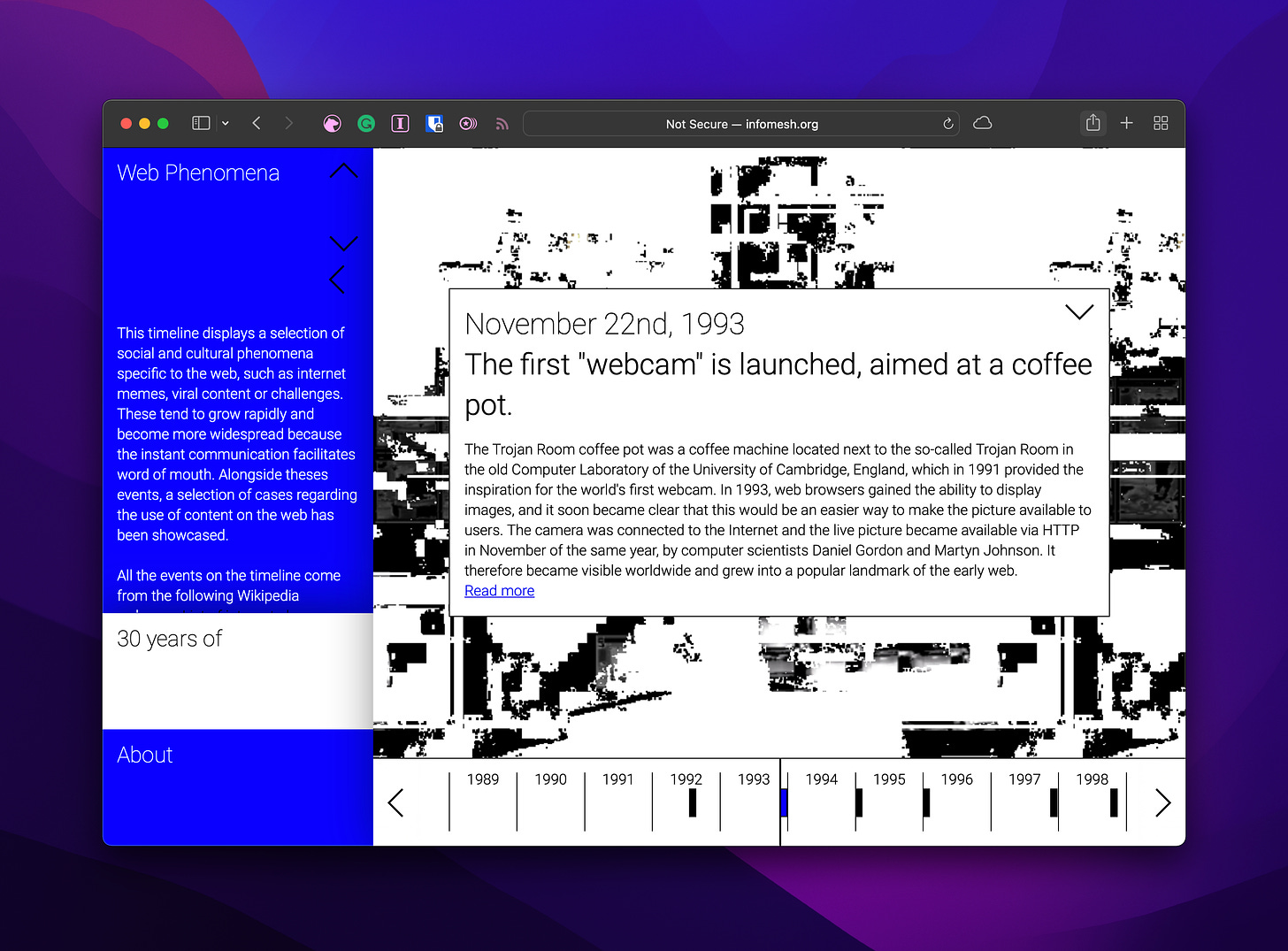
30 years of facts about the world wide web. I enjoyed the brutalist approach to the design. It behaves like this cross between how the internet used to look back then and now.
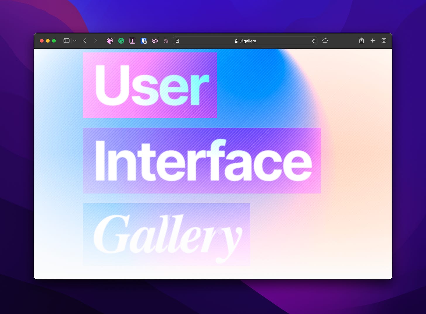
This website documents interface elements and their evolution with time. The visual design is quite 2022 though. It generously uses gradients, soft shadows and color blocking to highlight sections.
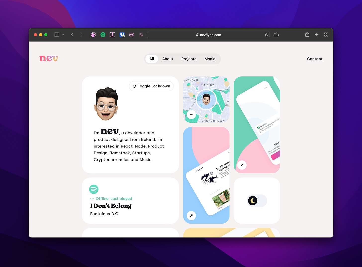
Portfolio website of Nev Flynn, a product designer, and developer based in Ireland. The inspiration seems to be taken from Apple’s Summary sheets. But here the designer has gone a step forward and added delightful interactions with each of the tiles.
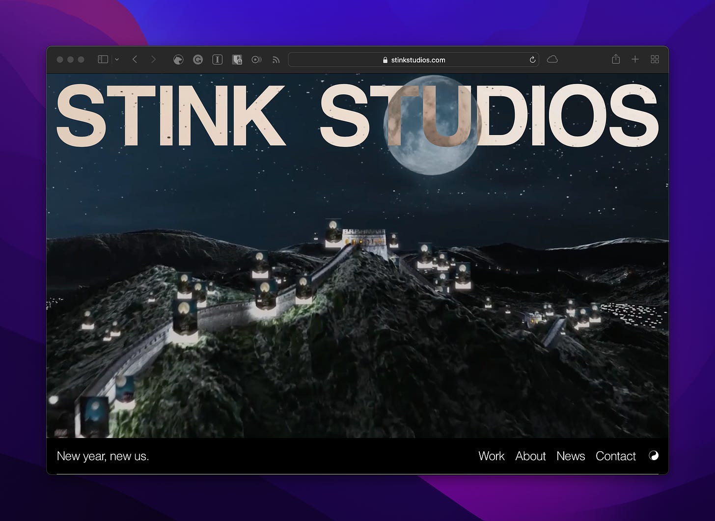
Portfolio website of Stick Studios, a creative agency building brand and digital customer experiences. Particularly digging the blend mode over the heading in the website. It’s adding an extra dimension to the page. Also don’t miss their loading animation right before the homepage.
That’ll be all for this one. Hope you enjoyed reading this. Share it with someone who you think will like Hyperlink by clicking on the button below👇 . Stay safe and see you'll in the next issue!
Also, you can follow me at Instagram for Musings, Twitter for Ramblings, and Command Space for work.


